


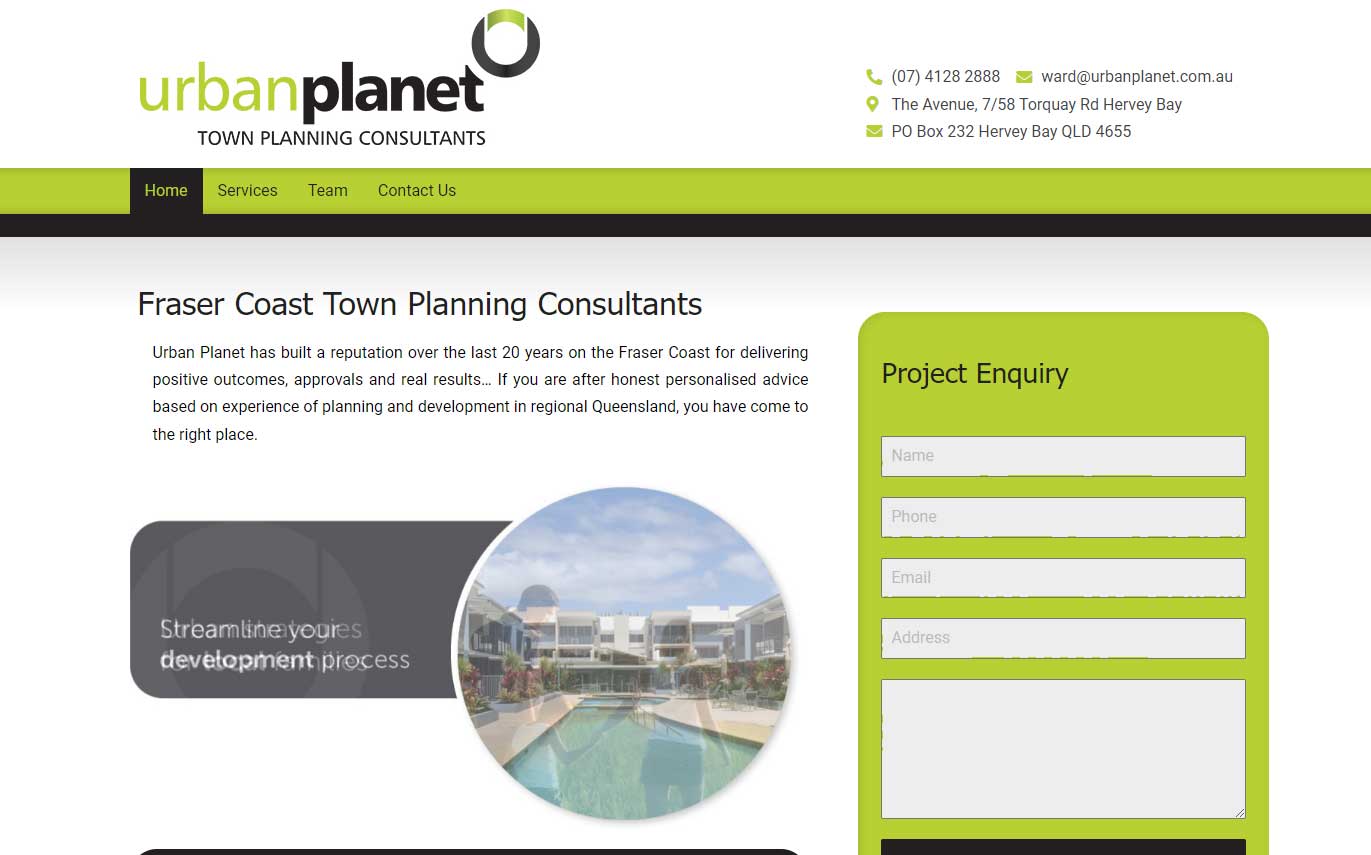
We want to thank the team at Urban Planet Town Planning in Hervey Bay for the opportunity to be able to create their new website. Urban Planet has been in the Town Planning business for over 20 years. If you need a competent partner in the Hervey Bay region for your townplanning needs, give them a call to learn more.
The new Urban Planet Website is aiming to be simple and to provide easy contact scenarios for potential customers. Based on pre-existing graphic design and photographic input, we brought the Urban Planet website up to date with SSL security, improved contact form spam filtering and mobile responsiveness.
In today’s age of mobile devices, having a mobile-responsive website is not just a luxury; it’s a necessity for businesses of all sizes and industries. With the rapid growth of mobile device usage, including smartphones and tablets, it has become increasingly important to ensure that your business website is optimized for mobile viewing. Does your website need to be brought up to speed to be mobile responsive? Contact us today at Web Design 4 Business to get you started.
- Changing Consumer Behavior: The way people access and interact with the internet has drastically changed over the years. Mobile devices have become the preferred method for browsing the internet, with a significant portion of online traffic coming from smartphones and tablets. If your website is not mobile-responsive, it can lead to a poor user experience, making it difficult for potential customers to navigate, read content, or complete desired actions. By having a mobile-responsive website, you cater to the changing consumer behavior and provide a seamless experience across different devices.
- Enhanced User Experience: User experience (UX) plays a vital role in determining how visitors perceive and interact with your website. A mobile-responsive design ensures that your website adapts and adjusts to fit different screen sizes and resolutions, providing an optimal viewing experience. Mobile responsiveness allows users to easily read content, navigate menus, and interact with features, leading to increased engagement and longer visit durations. A positive user experience on mobile devices can leave a lasting impression, encourage repeat visits, and boost customer satisfaction.
- Improved Search Engine Optimization (SEO): Search engines, like Google, prioritize mobile-responsive websites in their search results. In 2018, Google implemented mobile-first indexing, which means that the search engine primarily uses the mobile version of a website for indexing and ranking. A mobile-responsive design can positively impact your search engine optimization efforts by ensuring that your website is easily accessible and usable on mobile devices. This can lead to higher search engine rankings, increased organic traffic, and improved visibility among potential customers.
- Increased Reach and Accessibility: Having a mobile-responsive website enables you to reach a wider audience. With the prevalence of smartphones, people can access the internet from anywhere at any time. By catering to mobile users, you ensure that your website is accessible to potential customers who are on the go or prefer using mobile devices over desktop computers. A mobile-responsive design allows you to tap into this mobile-driven audience, expanding your reach and increasing the chances of attracting and retaining customers.
- Competitive Advantage: In today’s highly competitive business landscape, staying ahead of the competition is crucial. A mobile-responsive website can give you a significant edge over competitors who have not yet optimized their websites for mobile devices. When users have a positive mobile experience on your website, they are more likely to choose your products or services over competitors with poorly optimized or non-responsive websites. By providing a seamless and user-friendly mobile experience, you position your business as modern, customer-focused, and technologically adept.
- Consistent Brand Experience: Maintaining a consistent brand experience across different devices is essential for building trust and credibility. A mobile-responsive website ensures that your brand identity, messaging, and visual elements remain consistent, regardless of the device used to access your site. Consistency fosters brand recognition and strengthens your overall brand image. When users can easily navigate and engage with your website on any device, it reinforces your professionalism and commitment to providing a seamless experience.
In conclusion, having a mobile-responsive website is crucial for the success of your business in today’s mobile-driven world. By adapting to changing consumer behavior, enhancing user experience, improving SEO, increasing reach and accessibility, gaining a competitive advantage, and maintaining a consistent brand experience, you can maximize your online presence and effectively engage with your target audience. Investing in a mobile-responsive design is a strategic decision that will positively impact your business’s growth, reputation, and overall success.