




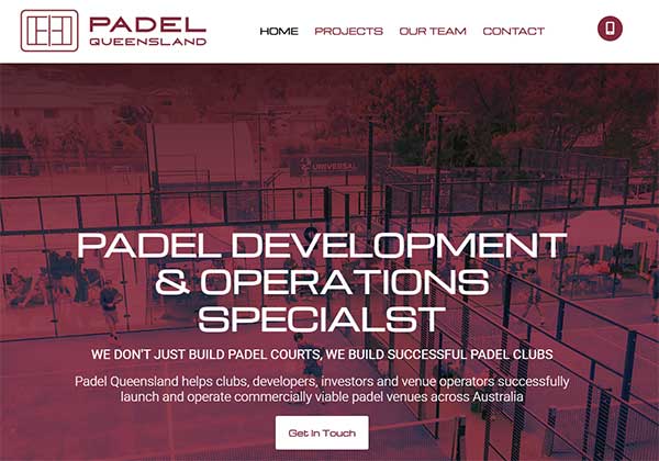
Thank You to the Gareth and the team at Padel Brisbane to working with us for your website refresher.
View the live website here
A portfolio website is often the first real interaction a potential client, employer, or collaborator has with a professional’s work. Unlike a résumé, which summarises experience in text, a portfolio site is expected to demonstrate ability through both content and presentation. That presentation matters because it shapes how the work is interpreted before anyone reads a single case study or project description.
When a portfolio “looks the part,” it does not simply mean it is visually attractive. It means the design communicates clarity, professionalism, and intent. The structure, spacing, typography, colour usage, and overall layout all work together to reinforce the quality of the work being displayed. If these elements are weak or inconsistent, they can reduce confidence in the work itself, regardless of how strong the underlying projects are.
In practice, a portfolio website functions as both a showcase and a filter. It attracts the right attention when done well, and it quietly loses opportunities when done poorly. This makes visual presentation a critical part of professional positioning.
First impressions define perceived value
People form opinions about websites extremely quickly. In many cases, this happens within seconds of loading the page. This means that before a visitor reads anything about experience or skills, they have already developed a sense of quality based purely on appearance and structure.
A clean, well-organised portfolio creates an immediate impression of competence. It signals that the creator understands presentation and detail, which are often directly associated with professionalism. On the other hand, a cluttered or outdated design can create doubt, even if the actual work is excellent.
This effect is not superficial. It is psychological. Humans rely on visual cues to make fast judgments about trustworthiness and ability. A portfolio that looks cohesive and intentional reduces uncertainty and encourages further exploration. A portfolio that appears neglected introduces friction and often leads to users leaving before engaging with the content.
A portfolio is a persuasive tool, not just a display
One of the most common mistakes in portfolio design is treating it as a simple gallery of past work. In reality, a portfolio is a persuasive tool. Its purpose is not just to show what has been done, but to convince the viewer of capability, reliability, and fit.
This means that presentation must support storytelling. Each project should be framed in a way that explains context, approach, and outcome. Even when the content is strong, poor visual structure can make it difficult to understand or appreciate.
Design plays a central role in this persuasion. The way projects are arranged, the emphasis placed on certain elements, and the flow between sections all influence how the viewer interprets the work. A strong portfolio guides attention deliberately, ensuring the most important information is seen first and understood clearly.
Without this intentional structure, even impressive work can feel fragmented or less impactful than it actually is.
Visual hierarchy and clarity improve communication
A well-designed portfolio relies heavily on visual hierarchy. This is the organisation of elements in a way that signals importance and guides the viewer’s attention. Without hierarchy, everything competes for attention equally, which creates confusion and reduces engagement.
Clear hierarchy ensures that key elements such as project titles, featured work, and summaries stand out appropriately. Supporting details remain accessible but do not overwhelm the primary message. This makes the browsing experience smoother and more intuitive.
Clarity is also reinforced through spacing, alignment, and consistency. When elements are evenly spaced and aligned, the content becomes easier to scan and understand. This reduces cognitive effort for the viewer and allows them to focus on the actual work rather than deciphering the layout.
Good visual structure does not distract from the content. It enhances it. It ensures that the viewer can quickly grasp what matters most and decide whether to continue exploring.
Design consistency builds credibility
Consistency is one of the most important aspects of a professional-looking portfolio. This includes consistent typography, colour usage, spacing, button styles, and layout structure across all pages and sections. When these elements vary unpredictably, the site feels disorganised, even if individual parts are well designed.
Consistency creates a sense of reliability. It shows that the creator has taken care to build a unified system rather than assembling unrelated parts. This is particularly important in creative and technical fields where attention to detail is often a key requirement.
A consistent design also helps reinforce branding. Even personal portfolios function as brands, and visual coherence strengthens recognition and memorability. When a portfolio looks cohesive, it communicates that the creator understands how to manage visual systems, not just individual projects.
Trust, professionalism, and perceived competence
Trust is a major factor in whether someone chooses to engage further with a portfolio. A visually strong website builds trust by reducing uncertainty. It signals that the creator understands modern standards and is capable of presenting work in a structured, thoughtful way.
Professionalism is often judged visually before it is judged logically. This means that even technical or highly skilled individuals can lose opportunities if their portfolio does not reflect their ability. A polished design acts as evidence of care, discipline, and awareness of audience expectations.
Perceived competence is closely tied to presentation. If a portfolio feels outdated or inconsistent, viewers may subconsciously assume the work itself is similarly outdated or inconsistent. This is not always fair, but it is a real effect of visual communication.
Mobile responsiveness and modern expectations
Modern portfolio websites are not viewed on a single device type. They are accessed on desktops, tablets, and mobile phones. This means that responsive design is not optional. A portfolio must adapt seamlessly to different screen sizes while maintaining clarity and usability.
If a portfolio looks excellent on desktop but breaks or becomes difficult to navigate on mobile, it undermines the overall impression. Users expect smooth experiences regardless of device. When this expectation is not met, it can create frustration and reduce credibility.
Responsiveness also contributes to the perception of modernity. A site that adapts well across devices signals that it has been built with current standards in mind. This reinforces the idea that the creator is technically capable and up to date with industry practices.
Conclusion
A portfolio website is far more than a collection of past work. It is a structured communication tool that influences perception before content is even fully engaged with. The way it looks plays a critical role in how it is understood, trusted, and valued.
When a portfolio looks the part, it supports the work it contains. It builds confidence, guides attention, and reinforces professionalism. When it does not, even strong work can lose impact. In competitive fields where attention is limited and decisions are made quickly, visual presentation becomes a defining factor in success.